Creating a calm and peaceful atmosphere in your home starts with the colors you choose for your walls and decor. Colors have a powerful effect on our mood and emotions, so selecting calm colors can help reduce stress and promote relaxation. Whether you’re repainting a single room or redesigning your entire home, understanding how to pick soothing hues makes a big difference. In this post, we’ll explore practical tips to help you choose calm colors that transform your living space into a tranquil retreat.
Why Color Choice Matters for Calm Spaces
Colors impact how we feel and behave. Bright, intense colors like red or neon shades can energize or even agitate us, while softer, muted tones tend to create a sense of calm. When choosing colors for a space where you want to feel relaxed—such as bedrooms, living rooms, or meditation areas—it’s important to focus on hues that promote peace rather than excitement.
Popular Calm Color Families
Before diving into tips, here are some color families commonly used to create calm environments:
– Blues: Often associated with the sky and water, blue is naturally soothing and can help lower heart rate and blood pressure.
– Greens: Green has a refreshing, restful quality that connects us to nature.
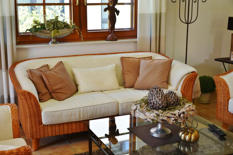
– Neutrals: Soft grays, beiges, and creamy whites provide a gentle, grounding backdrop.
– Pastels: Light shades of lavender, peach, or pink offer softness without overwhelming the senses.
Tips for Choosing Calm Colors for Your Home
1. Consider Natural Light in Your Space
The amount and type of natural light in a room greatly influence how colors appear. North-facing rooms tend to have cooler, dimmer light, making blues and grays feel even cooler, while south-facing rooms get warm, bright light that can enhance warm neutrals and soft pastels. Test paint samples in different lighting conditions before committing.
2. Opt for Muted Shades Rather Than Bright Ones
Instead of bright or saturated colors, choose muted or toned-down versions of your favorite calm hues. For example, instead of royal blue, try slate or dusty blue. Muted colors usually contain gray or beige undertones, which soften their appearance and create a more restful atmosphere.
3. Use a Limited Color Palette
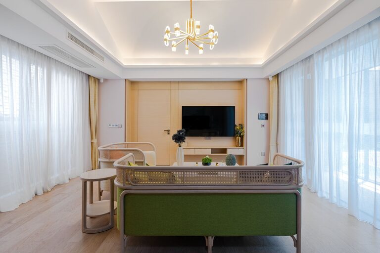
Using too many colors can create visual chaos, reducing the calming effect. Stick to two or three complementary calm colors within a room. This approach helps the space feel cohesive and soothing without feeling dull.
4. Balance Warm and Cool Tones
While cool colors like blue and green are naturally calming, incorporating some warm neutrals can prevent a room from feeling too cold or sterile. For instance, pair soft blue walls with warm wood furniture or beige textiles to create a balanced, inviting space.
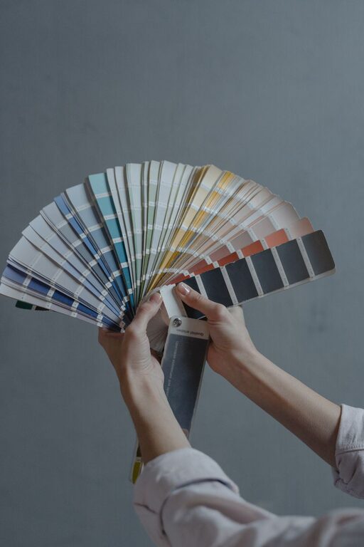
5. Test Samples on Your Walls
Paint small sample patches on different walls in the room. Observe how the colors change throughout the day as the light shifts. This step ensures you pick a calm color that looks good in your unique space.
6. Think About the Room’s Purpose
The function of a room can guide your color choice. For example:
– Bedroom: Soothing blues, lavender, or soft greens promote restful sleep.
– Living room: Warm neutrals or gentle greens make the space inviting and relaxing.
– Bathroom: Pale blues or seafoam greens evoke cleanliness and calm.
– Home office: Muted blues or greens can help focus without causing stress.
7. Don’t Forget Texture and Finish
Calm colors work well with matte or eggshell finishes, which diffuse light and reduce glare. Avoid glossy finishes that can reflect too much light and disrupt the peaceful mood. Adding soft textures through fabrics, rugs, or pillows can complement your color choices, enhancing the calm feeling in the room.
8. Use Color Psychology as a Guide
Understanding the emotional effects of colors can help you select the best calm hues:
– Blue: Encourages relaxation, trust, and calmness.
– Green: Symbolizes balance, renewal, and harmony.
– Lavender: Promotes serenity and gentle energy.
– Beige and Soft Grays: Provide a neutral, stable background that supports other calm colors.
9. Incorporate Nature-Inspired Colors
Bringing colors found in nature into your home, such as soft moss greens, sky blues, or sandy beiges, can deepen the sense of calm. Nature-inspired palettes tap into our innate connection with the outdoors, which has been shown to reduce stress and improve well-being.
10. Personalize Your Palette
Ultimately, calm colors are those that make you feel at ease. If a particular shade brings you comfort or joy, include it, even if it’s outside typical “calm” recommendations. Your personal connection to color is just as important as any rule.
Final Thoughts
Choosing calm colors for your home doesn’t have to be complicated. Focus on muted, natural shades, consider your room’s lighting and purpose, and test samples before making a decision. By thoughtfully selecting your color palette, you can create a soothing environment that supports relaxation and peace every day.
Remember, your home is your sanctuary. The colors you choose play a big role in making that sanctuary calm and welcoming. Happy decorating!
About the Author